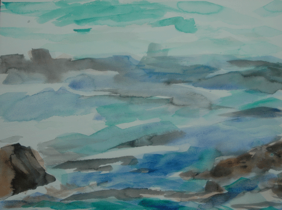
 This is the watercolor version of Quarter 3. When I was working on the pastel version below I decided to deepen the values in front. I also wanted the rocks to read a rocks so I pumped up the value volume a bit.
 The pastel version. This is very abstract. Of course I have that bipolar tug with this one. Part of me says don't touch it again and the other wants to go in and define it more.
2 comments:
It is nice to see the two paintings together. I lean toward the pastel because I like more intense color. The watercolor is lovely with lots of movement but more calm than the pastel. Anyway, I like them both. :)
Thanks Jo Im enjoying this series.
Post a Comment